The White House (quietly) asks for feedback on the open government section of its website

Obama at computer. Official White House Photo by Pete Souza

Official White House Photo by Pete Souza

Over at Govfresh, Luke Fretwell took note of the White House asking for feedback on the open government section of WhiteHouse.gov. Yesterday, Corinna Zarek, senior advisor for open government in the White House Office of Science and Technology Policy (OSTP), where the administration’s Open Government Initiative was originally spawned under former deputy chief technology officer Beth Noveck, published a email to the US Open Government Google Group:

We are working on a refresh of the Open Gov website, found at whitehouse.gov/open, and we’d like your help!

If you’re familiar with the history of the page, you can see we have begun updating it by shifting some of the existing content and adding new tabs and material.

What suggestions do you have for the site? What other efforts might we feature?

Please let us know – reply back to this thread, email us at opengov@ostp.gov, or tweet us at @OpenGov!

Here’s some background on the group and its purpose: The White House’s Open Government Working Group needs to solicit feedback from civil society in the United States on the various initiatives and commitments the administration has made. Such engagement is essential to the providing feedback from governance experts, advocates and the public on the development of new agency open government plans and discuss progress on the national open government action plan.

As a result of a discussion at the working group this spring, OSTP created the US Open Government discussion group to connect White House staff and agency officials who work on open government to people outside of the federal government. According to the group’s description, the goal of this group is to “provide a safe and welcoming arena for government-focused collaboration and news-sharing around Open Government efforts of the United States government.” That “safe and welcoming” language is notable: the group is moderated by OpenTheGovernment.org with an eye on constructive, on-topic feedback, as opposed to, say, the much more open-ended freewheeling posts and threads on the (long-since closed) Open Government Dialog of 2009 or Change.gov.

After almost six months, the open government group, which can be accessed through a Web browser or using an email listserv, has 177 members and 37 posts. By almost any measure, these are extremely low levels of participation and engagement, although the quality of feedback from those members remains extremely high. By way of contrast, a open government and civic tech group on Facebook now has over 1900 members and an open government community on Google+ has over 1400 members, with both enjoying almost daily contributions. Low participation rates on this US Open Government Google Group are likely due in part to lack of promotion by other White House staff to the media or using the various social media platforms has joined, which cumulatively have millions of followers, and, more broadly, the historic lows of public trust in government which have created icy headwinds for open government initiatives in recent years.

So far, Zarek’s solicitation has received two responses. One comes from Daniel Schuman, policy director for Citizens for Responsibility and Ethics (CREW) in Washington, who made great suggestions, like adding a link to ethics.data.gov, a list of staff working on openness in the White House and their areas of responsibility, a link to 18f and the USDS.

“Finally, there are many great ideas about how to make government more open and transparent,” wrote Schuman. “Consider including a way for people to submit ideas where those submissions are also visible to the public (assuming they do not violate TOS). Consider how agencies or the government could respond to these suggestions. Perhaps a miniature version of “We the People,” but without the voting requiring a response.”

The other idea comes from open government consultant Lucas Cioffi, who suggested adding a link to a “community-powered open government phone hotline” like the experiment he recently created.

To those ideas, I’ll add eight quick suggestions in the spirit of open government:

1) Reinstate the open government dashboard that was removed and update it to the current state of affairs and compliance, with links to each. The Sunlight Foundation and CREW have already audited agency compliance with the Open Government Directive. By keeping an updated scorecard in a prominent place, the Obama administration could both increase transparency to members of the public wondering about what has been done and by whom, and put more pressure on agencies to be accountable for the commitments they have made.

2) Re-integrate individual case studies from the “Innovator’s Toolkit,” which was also removed, under participation and collaboration

3) Create a Transparency tab and link to the “IC on the Record” tumblr and other public repositories for formerly secret laws, policies or documents that have been released.

4) Blog and tweet more about what’s happening in the open government world outside of the White House. Multiple open government advocates do daily digests and there’s a steady stream of news and ideas on the #opengov and #opendata hashtags on Twitter. Link to what’s happening and show the public that you’re reading and responding to feedback.

5) Link to the White House account and open government projects on Github under both the new participation and collaboration tabs, like Project Open Data.

6) Highlight 18F’s effort to reboot the Freedom of Information Act.

7) Publish the second national action plan on open government as HTML on the site, and post and link to a version on Github where people can comment on it.

8)  Create a FAQ under “participation” that lists replies to questions sent to @OpenGov

If you have ideas for what should be wh.gov/open, well, now you know who to tell, and where.

City of Los Angeles launches open data pilot and survey

Upon election, I wondered whether Mayor-Elect Eric Garcetti would reboot Los Angeles city government for the 21st century. After 4 months, there are several promising green shoots to report.

First, Mayor Garcetti vowed to modernize city government in the City of Angels, posting agency performance statistics online and reviewing all departments. Now, the City of Los Angeles has launched its own open data pilot project using ESRI’s ArcGIS platform.

laskyline_logo_final_7_1

For veterans of such efforts, a portal to mapping data may not be particularly exciting or useful, but it’s a start. Notably, the city has put up an online survey where people can request other kind of city data and suggest changes or improvements to the pilot website.

Here’s a few suggestions:

1) Study how the cities of Chicago and New York cleaned, published and used data, including market demand.

2) Talk to the data desk at the Los Angeles Times. If you want your city’s performance data to be used by media for accountability and transparency, address their concerns.

3) Make a list of every single request for data made by journalists in Los Angeles under the California Records ActRelease the data and proactively publish that type of data going forward.

4) If your goal is economic outcomes from open data, review all requests for city data from businesses and prioritize release of those data sets. Engage startups and venture capitalists who are consuming open data and ask about quality, formats and frequency of release.

5) Check out New York City’s gorgeous new open data site and the ongoing release of more data sets. Set those free, too.

6) Check out the new NYC.gov, Utah.gov and gov.uk in the United Kingdom for ideas, principles and models. Of note: the use of open standards, citizen-centricity, adaptive Web design, powerful search, focus on modern design aesthetic.

Good luck, LA!

Open data in beta: From Data.gov to alpha.data.gov to next.data.gov

Writing at the White House blog, deputy US CTO Nick Sinai and Presidential Innovation Fellow Ryan Panchadsaram explain what’s new behind the next iteration of the federal open government data platform.

next-data-gov

The first incarnation of Data.gov and subsequent iterations haven’t excited the imagination of the nation. The next version, which employs open source technology like WordPress and CKAN, uses adaptive Web design and features improved search.

It also, critically, highlights how open data is fueling a new economy. If you read Slate, you already knew about how the future is shaping up, but this will provide more people with a reference. Great “next” step.

If you have opinions, questions or suggestions regarding the newest iteration, the Data.gov team is looking for feedback and Project Open Data is encouraging people to collaborate in the design process by creating pull requests on Github or commenting on Quora or Twitter.

Open by design: Why the way the new Healthcare.gov was built matters [UPDATED]

UPDATE: The refresh of Healthcare.gov in June went well. On October 1st, when the marketplace for health insurance went live at the site.gov, millions of users flocked to the website and clicked “apply now.” For days, however, virtually none of them were able to create accounts, much less complete the rest of the process and enroll for insurance. By the end of the week, however, it was clear that the problems at Healthcare.gov were not just a function of high traffic but the result of the failure of software written by private contractors, with deeper issues that may extend beyond account creation into other areas of the site. On October 9th, as prospective enrollees continued to be frustrated by error-plagued websites around the country, I joined Washington Post TV to give a preliminary post-mortem on why the HealthCare.gov relaunch went so poorly.

The article that follows, which was extended and published at The Atlantic, describes the team and process that collaborated on launch of the new site in June, not the officials or contractors that created the botched enterprise software application that went live on October 1st. In the Atlantic, I cautioned that “…the site is just one component of the insurance exchanges. Others may not be ready by the October deadline.”  The part of the site I lauded continues to work well, although the Github repository for it was taken offline. The rest has …not. I’ve taken some heat in the articles’ comments and elsewhere online for being so positive, in light of recent events, but the reporting holds up: using Jekyll is working. Both versions of the story, however, should have included a clearer caveat that the software behind the website had yet to go live — and that reports that the government was behind on testing Healthcare.gov security suggested other issues might be present at launch. If readers were misled by either article, I apologize. –Alex


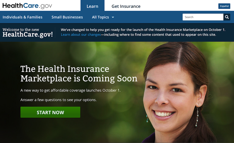
Healthcare.gov already occupies an unusual place in history, as the first website to be demonstrated by a sitting President of the United States. In October, it will take on an even more important historic role, guiding millions of Americans through the process of choosing health insurance.

How a website is built or designed may seem mundane to many people in 2013, but when the site in question is focused upon such a function, it matters. Yesterday, the United States Department of Health and Human Services (HHS) relaunched Healthcare.gov with a new look, feel and cutting edge underlying architecture that is beyond rare in federal government. The new site has been built in public for months, iteratively created by a team of designers and engineers using cutting edge open source technologies. This site is the rarest of birds: a next-generation website that happens to be a .gov.

healthcare-gov-homepage

“It’s fast, built in static HTML, completely scalable and secure,” said Bryan Sivak, chief technology officer of HHS, in an interview. “It’s basically setting up a Web server. That’s the beauty of it.”

The people building the new Healthcare.gov are unusual: instead of an obscure sub-contractor in a nameless office park in northern Virginia, a by a multidisciplinary team at HHS worked with Development Seed, a scrappy startup in a garage in the District of Columbia that made its mark in the DC tech scene deploying Drupal, an open source content management system that has become popular in the federal government over the past several years.

“This is our ultimate dogfooding experience,” said Eric Gundersen, the co-founder of Development Seed. “We’re going to build it and then buy insurance through it.”

“The work that they’re doing is amazing,” said Sivak, “like how they organize their sprints and code. It’s incredible what can happen when you give a team of talented developers and managers room to work and let them go.”

What makes this ambitious experiment in social coding unusual is that the larger political and health care policy context that they’re working within is more fraught with tension and scrutiny than any other arena in the federal government. The implementation and outcomes of the Patient Protection and Affordable Care Act — AKA “Obamacare” — will affect millions of people, from the premiums they pay to the incentives for the health care they receive.

“The goal is get people enrolled,” said Sivak. “A step to that goal is to build a health insurance marketplace. It is so much better to build it in a way that’s open, transparent and enables updates. This is better than a big block of proprietary code locked up in CMS.”

healthcare-gov-marketplace-graphic

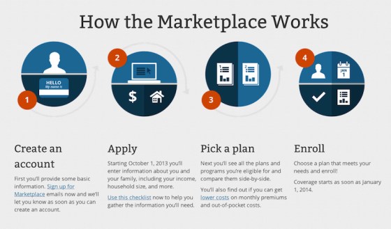
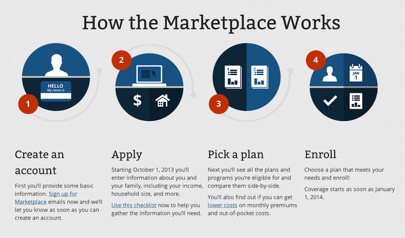
The new Healthcare.gov will fill a yawning gap in the technology infrastructure deployed to support the mammoth law, providing a federal choice engine for the more than thirty different states that did not develop their own health insurance exchanges. The new website, however modern, is just one component of the healthcare insurance exchanges. Others may not be ready by the October deadline. According to a recent report from the Government Accountability Office, the Department of Health and Human Services’ Centers for Medicare & Medicaid Services (CMS) is behind in implementing key aspects of the law, from training workers to help people navigate the process to certifying plans that will sold on the exchanges to determining the eligibility of consumers for federal subsidies. HHS has expressed confidence to the GAO that exchanges will be open and functioning in every state on October 1.

On that day, Healthcare.gov will be the primary interface for Americans to learn about and shop for health insurance, as Dave Cole, a developer at Development Seed, wrote in a blog post this March. Cole, who served as a senior advisor to the United States chief information officer and deputy director of new media at the White House, was a key part of the team that moved WhiteHouse.gov to Drupal. As he explained, the code will be open in two important ways:

First, Bryan pledged, “everything we do will be published on GitHub,” meaning the entire code-base will be available for reuse. This is incredibly valuable because some states will set up their own state-based health insurance marketplaces. They can easily check out and build upon the work being done at the federal level. GitHub is the new standard for sharing and collaborating on all sorts of projects, from city geographic data and laws to home renovation projects and even wedding planning, as well as traditional software projects.

Moreover, all content will be available through a JSON API, for even simpler reusability. Other government or private sector websites will be able to use the API to embed content from healthcare.gov. As official content gets updated on healthcare.gov, the updates will reflect through the API on all other websites. The White House has taken the lead in defining clear best practices for web APIs.

Thinking differently about a .gov

According to Sivak, his team didn’t get directly involved in the new Healthcare.gov until November 2012. After that “we facilitated the right conversations around what to build and how to build it, emphasizing the consumer-facing aspects of it,” he said. “The other part was to figure out what the right infrastructure was going to be to build this thing.”

That decision is where this story gets interesting, if you’re interested in how government uses technology to deliver information to the people it serves. Government websites have not, historically, been sterling examples of design or usability. Unfortunately, in many cases, they’ve also been built at great expense, given the dependence of government agencies on contractors and systems integrators, and use technologies that are years behind the rest of the Web. Healthcare.gov could have gone in the same direction, but for the influence of its young chief technology officer, an “entrepreneur-in-residence” who had successfully navigated the bureaucracies of the District of Columbia and state of Maryland.

“Our first plan was to leverage Percussion, a commercial CMS that we’d been using for a long time,” said Sivak. “The problem I had with that plan was that it wasn’t going to be easy to update the code. The process was complicated. Simple changes to navigation were going to take a month.”

At that point, Sivak did what most people do in this new millennium when making a technology choice: he reached out to his social networks and went online.

“We started talking to people about a better way, including people who had just come off the Obama campaign,” he said. “I learned about the ground they had broken in the political space, from A/B testing to lightweight infrastructure, and started reading about where all that came from. We started thinking about Jekyll as a platform and using Prose.io.”

After Sivak and his team read about Development Seed’s work with Jekyll online, they contacted the startup directly. After a little convincing, Development Seed agreed to do one more big .gov project.

“A Presidential Innovation Fellow used same tech we’re using for several of their projects,” said Cole. “Bryan heard about it and talked to us. He asked where we would go. We wanted to be on Github. We knew there were performance and reliability benefits from building the stack on HTML.”

Jekyll, for those who are unfamiliar with Web development trends, is a way for developers to build a static website from dynamic components. Instead of running a traditional website with a relational database and server-side code, using Jekyll enables programmers to create content like they create code. The end result of this approach is a site that loads faster for users, a crucial performance issue, particularly on mobile devices.

“Instead of farms of application servers to handle a massive load, you’re basically slimming down to two,” said Sivak. “You’re just using HTML5, CSS, and Javascript, all being done in responsive design. The way it’s being built matters. You could, in theory, do the same with application servers and a CMS, but it would be much more complex. What we’re doing here is giving anyone with basic skills the ability to do basic changes on the fly. You don’t need expensive consultants.”

That adds up to cost savings. Sites that are heavily trafficked — as Healthcare.gov can reasonably be expected to be – normally have to use a caching layer to serve static content and add more server capacity as demand increases.

“When we worked with the World Bank, they chose a plan from Rackspace for 16 servers,” said Gundersen. “That added tens of thousands of dollars, with a huge hosting bill every month.”

HHS had similar strategic plans for the new site, at least at first.

“They were planning 32 servers, between staging, production and disaster recovery, with application servers for different environments,” said Cole. “You’re just talking about content. There just needs to be one server. We’re going to have 2, with one for backup. That’s a deduction of 30 servers.”

While Jekyll eliminates the need for a full-blown content management system on the backend of Healthcare.gov (and with it, related costs), the people managing the site still need to be able to update it. That’s where Prose.io comes in. Prose.io is an open source content editor created by Development Seed that gives non-programmers a clean user interface to update pages.

“If you create content and run Jekyll, it requires content editors to know code,” said Cole. “Prose is the next piece. You can run it on your on own servers or use a hosted version. It gives access to content in a CMS-like interface, basically adding a WYSIWYG skin, giving you a text editor in the browser.”

In addition to that standard “what you see is what you get” interface, familiar from WordPress or Microsoft Word, Prose.io offers a couple of bells and whistles, like mobile editing.

“You can basically preview live,” said Cole. “You usually don’t get a full in-browser preview. The difference is that you have that with no backend CMS. It’s just a directory and text files, with a Web interface that exposes it. There are no servers, no infrastructure, and no monthly costs. All you need is a free Web app and Github. If you don’t want to use that, use Git and Github Enterprise.” Update: Cole wrote more about launching Healthcare.gov on the DevelopmentSeed blog on Tuesday.

Putting open source to work

Performance and content management aside, there’s a deeper importance to how Healthcare.gov is being built that will remain relevant for years to come, perhaps even setting a new standard for federal government as a whole: updates to the code repository on Github can be adopted for every health insurance exchange using the infrastructure. (The only difference between different state sites is a skin with the state logo.)

“We have been working in the .gov space for a while,” said Gundersen. “Government people want to make the right decisions. What’s nice about what Bryan is doing is that he’s trying to make sure that everyone can learn from what HHS is doing, in real-time. From a process standpoint, what Bryan is doing is going to change how tech is built. FCC is watching the repository on Github. When agencies can collaborate around code, what will happen? The amount of money we have the opportunity to save agencies is huge.”

Collaboration and cascading updates aren’t an extra, in this context: they’re mission-critical. Sivak said that he expects the new site to be improved iteratively over time, in response to how people are actually using it. He’s a fan of the agile development methodology that has become core to startup development everywhere, including using analytics tools to track usage and design accordingly.

“We’re going to be collecting all kinds of data,” said Sivak. “We will be using tools like Optimizely to do A/B and multivariate testing, seeing what works on the fly and adapting from there. We’re trying to treat this like a consumer website. The goal of this is to get people enrolled in health care coverage and get insurance. It’s not simple. It’s a relatively complex process. We need to provide a lot of information to help people make decisions. The more this site can act in a consumer-friendly fashion, surfacing information, helping people in simple ways, tracking how people are using it and where they’re getting stuck, the more we can improve.”

Using Jekyll and Prose.io to build the new Healthcare.gov is only the latest chapter in government IT’s quiet open source evolution. Across the federal government, judicious adoption of open source is slowly but surely leading to leaner, more interoperable systems.

“The thing that Git is all about is social coding,” said Sivak, “leveraging the community to help build projects in a better way. It’s the embodiment of the open source movement, in many ways: it allows for truly democratic coding, sharing, modifications and updates in a nice interface that a lot of people use.”

Open by design

Sivak has high aspirations, hoping that publishing the code for Healthcare.gov will lead to a different kind of citizen engagement.

“I have this idea that when we release this code, there may be people out there who will help us to make improvements, maybe fork the repository, and suggest changes we can choose to add,” he said. “Instead of just internal consultants who help build this, we will suddenly have legions of developers.”

Not everything is innovative in the new Healthcare.gov, as Nick Judd reported at TechPresident in March: the procurement process behind the new site is complicated and the policy and administrative processes that undergird it aren’t finished yet, by any account.

The end result, however, is a small startup in a garage rebuilding one of the most important federal websites of the 21st century in a decidedly 21st century way: cheaper, faster and scalable, using open source tools and open standards.

“Open by design, open by default,” said Sivak. “That’s what we’re doing. It just makes a lot of sense. If you think about what should happen after this year, all of the states that didn’t implement their systems, would it make sense for them to have code to use as their own? Or add to it? Think about the amount of money and effort that would save.”

That’s a huge win for the American people. While the vast majority of visitors to Healthcare.gov this fall will never know or perhaps care about how the site was built or served, the delivery of better service at lowered cost to taxpayers is an outcome that matters to all.

Designing better government with open government at the CFPB

Today, the local .gov startup goes live. While ConsumerFinance.gov went online back in February, today, on the anniversary of H.R.4173, the Dodd-Frank Wall Street Reform and Consumer Protection Act, the Consumer Financial Protection Board officially launches today, with Richard Cordray nominated to lead it. The Sunlight Foundation is liveblogging the Senate hearings this morning, for those interested.

Many questions about the future of the agency remain (Wall Street and Republicans have not been sparing offering criticism over the past year) but credit where credit is due: the new consumer bureau has been open to ideas about how it can do its work better. This approach is what led New York Times personal finance columnist Ron Lieber to muse last week that “its openness thus far suggests the tantalizing possibility that it could be the nation’s first open-source regulator.”

When a regulator asks for help redesigning a mortgage disclosure form, something interesting is afoot.

It’s extremely rare that an agency gets built from scratch, particularly in this economic and political context. It’s notable, in that context, that the 21st century regulator has embraced many of the principles of open government in leveraging technology to stand up the Consumer Financial Protection Bureau. Elizabeth Warren, the architect of the agency, spoke to how open government, citizens and technology factor into the bureau’s work earlier this year:

Better government by design

Open government isn’t just about first principles for accountability, open data, social media, transparency, cultural change, citizen participation, innovation or feedback loops, however, though all of those factors matter. As the work of Code For America has shown this year, design matters in open government. Better citizen experience, communication and customer service depends on better design.

Lois Beckett aptly connected how the dots about why design matters to the CFPB’s work this week at ProPublica, where she wrote about the challenges the innovative financial regulator faces as it starts up.

…as the political battle rages on and media scrutiny focuses on Elizabeth Warren’s political future, little attention has been given to what the bureau has actually done. And its initial efforts are interesting, especially because they show a commitment to open government and real public engagement. (Ron Lieber noted that its blog actually accepts comments—”unlike, say, the White House’s.”)

The bureau’s mission is to create transparency in an industry dominated by confusing claims and mouse print. Good design isn’t just a perk here—it’s fundamental to the bureau’s regulatory efforts.

Case in point: One of the CFPB’s top priorities has been streamlining the federally required mortgage disclosure documents. If that sounds like a mouthful, it’s worse on paper: two separate, complicated forms that are confusing for customers and, the bureau contends, also burdensome for many mortgage servicers to fill out.

The goal is to replace them with a single, two-page document that clearly answers the questions: “Can I afford this mortgage?” and “Can I get a better deal somewhere else?”

Two of the potential designs for the new form each have a note at the top, in bold print: “You have no obligation to choose this loan. Shop around to find the best loan for you.”

The bureau’s other projects include improving transparency about credit card prices and fees, the exchange rates used for remittance transfers of money to other countries and the credit scores sold to consumers and creditors.

Using heatmaps and 13,000 clicks to understand pain points for mortgage disclosure? Data-driven government may have legs.

It’s not just the heatmaps: the CFPB reports that they read and analyzed the comments themselves. “There is symmetry here,” write the Web staff. “Heatmaps make it easier to understand and compare data. We want to improve disclosure so it is easier for consumers and lenders to understand and compare when they evaluate mortgage loans.”

As the newest .gov startup continues to scale, we’ll see if more experiments in open government design are given “freedom to fail,” a latitude that the father of the Internet, Vint Cerf, has hailed as an essential ingredient for government innovation. Stay tuned, and keep at eye on the CFPB.

National Archives launches redesigned Archives.gov under open government plan

Today the National Archives launched its redesign of Archives.gov redesign.

“It’s essential for the National Archives to have a user-friendly online presence,” said Archivist of the United States David S. Ferriero in a prepared statement. Ferriero is the first Archivist to blog, tweet (@dferriero), and launch a Facebook page. “We hope to reach new audiences while still engaging our long-time users, researchers and visitors. This redesign – part of the National Archives flagship Open Government Initiative – reflects the ongoing effort to engage the public and make records of the National Archives easier to find and use.”

If you’re not following the work of the National Archivist, today is a good day to reflect on his progress and the importance of his work. Reflect on what he told the New York Times:

How many digitized records should be available online? “If I had my way,” he replied, “everything.”

The Obama administration has also given the National Archives responsibility for reviewing the declassification of 400 million pages of secret documents by the end of 2013.

Mr. Ferriero’s goal, he said, is “to ensure that we have the user at the center of our thinking — historians, genealogists, open government folks. What can we do to make their lives easier?”

Each of these flagship initiatives, many of which are listed at the WhiteHouse.gov open government innovations gallery, are supposed to deliver upon the signature elements of each agency’s mission. In terms of the National Archives, the redesign was “intended to encourage online user participation in the redesign of our website.” Does it deliver?

Here’s the old design of Archives.gov:

The research that preceded the redesign looked at what people do when they come to Archives.gov and what they do there.

Here are the results of the National Archives’ data analysis of Archives.gov “customers”:

How frequently do you visit this site?
69% First time
14% Every 6 months or less
9% About once a month
5% About once a week

In what role are you using the web site today?
30% Veteran or Veteran’s family
23% Genealogist or family historian
14% Educator or student
14% Researcher

What were you primarily looking for today?
28% Historical Documents
25% Veterans’ Service Records
19% Genealogy or family history information
9% Other

How would you most like to interact with this site?
41% Bookmark or tag pages
35% None
15% Receiving newsletters/email updates
8% Watching Vodcasts or video

The new Archives.gov was based in part on that feedback and user need:

On first glance, and after some time clicking around, the answer is a qualified “yes.” This version of the Archives.gov redesign came about through a vote on the homepage design using Ideascale and in-person events, receiving in total some 3,257 votes. The redesign includes streamlined access to historical documents and military service records, an important improvement, given the eye-opening statistic that 81 percent of Archives.gov visitors are looking for this information.

The new design is cleaner, features clearer organization of content and loaded more quickly on my mobile device. The search field, one of the critical features of any modern website, is larger and raised to greater prominence in the redesign. I don’t see a mobile version of the site yet, and there is as of yet “no app for that,” unlike, say, the Library of Congress. That may change.

With respect to another stated aim of the project, the redesign does prominently display the Archives.gov social media accounts, although in muted colors that, while fitting look and feel, don’t catch the eye. No social content is featured on the homepage or the dedicated section, though it’s not hard to find those accounts on the master list of social media. There are some real gems to be fond in there, particularly in the NARA Flickr feed.

Archives Wiki: Our Archives Wiki
Blog – NARAtions, the U.S. National Archives: Blog - NARAtions, the U.S. National Archives
Facebook – US National Archives: Facebook - US National Archives
Flickr – US National Archives Photostream: Flickr - US National Archives Photostream
RSS Feed – News from the U.S. National Archives: RSS Feed - News from the U.S. National Archives
Twitter – @ArchivesNews: Twitter - @archivesnews
YouTube – US National Archives Channel: YouTube - US National Archives Channel

There are a host of other accounts in there for regional archives, presidential libraries or specific topics. For more on the back story behind the design, read over the minutes from last month’s researcher meeting:

The website was last updated several years ago. This time, we are revising it to focus on tasks that people are trying to accomplish when they come to our website.

We collected information from researchers on what you wanted in a variety of ways over several months including asking staff, researchers, veterans, patrons in line at exhibits, etc. This is part of Open Government from December 2009. The Flagship initiative is to redesign by matching the needs of all users (researchers, educators, students, and those just browsing to see the founding documents).

We have the new website categorized into sections. There are five main sections: veterans, researchers, educators and students, locations, and our online store.

Other pages will focus on genealogy, Congress, records preservation, Federal records managers, publications, offices in NARA, and information about us in general. It also includes an agency index, FAQs, and social media (e.g., blogs like NARAtions and AOTUS).

The research section has basic information on how to do research at each of the facilities and links to specific topics like the Civil War.

The new website rolls out next month in December. This is the first phase of the redesign. The focus is on the home page, researchers, veterans, education, and will then move onto other areas.

The 1940s census will be available online in 2012 spring.

“Hire a Researcher” will still be available. All content will migrate over. You do not need to resubmit information. All current information will come over. If you need to resubmit information, we will let you know. We do an annual contact check to revise the list.

This is a significant improvement and one that the Archives staff should be commended upon. If you have feedback, they’ve made it clear that they’re listening: comment on the NARAtions Blog or write to webprogram@nara.gov.