SahelResponse.org showcases the power of open data and neocartography

On January 9th, I wondered whether 2012 would be “the year of the open map.” I started reporting on digital maps made with powerful new software and open data last winter, in the context of open government.

In the months since, I’ve seen many more maps emerge from the work of data journalists and government, including a beautiful one made with TileMill and open data from aid agencies at SahelResponse.org. You can explore the map in the embed below:

Nate Smith, who works at DevelopmentSeed, the makers of MapBox and TileMill, blogged about SahelReponse.org at PBS Mediashift.

To bring key aid agencies together and help drive international response, the SahelResponse.org data-sharing initiative maps information about the ongoing food crisis in the Sahel region of West Africa. More than 18 million people across the Sahel are at risk and in need of food assistance in the coming months, according to the United Nations. Recent drought, population movements, and conflict have created a rapidly changing emergency situation. As in any crisis, multiple agencies need to respond and ramp up their coordination, and access to data is critical for effective collaboration. In a large region like the Sahel, the band of mostly arid land below the Sahara Desert stretching across the continent, effective coordination and collaboration are critical for responding effectively.

Thanks to new technologies like TileMill, and an increased adoption of open data, it was possible to put all the key data about the crisis — from relief access routes to drought conditions and population movements — in one place, openly available and mapped to give it further context.

More than half a year later, on other words, I think the prediction that 2012 will be the year of the open map is being born out. The adoption of OpenStreetMap by Foursquare was a notable data point, as was StreetEast moving to OpenStreetMap from Google Maps. In response to the challenge, Google slashed its price for using the Google Maps API by 88%. In an ideal world, the new competition will result in better products and more informed citizens.

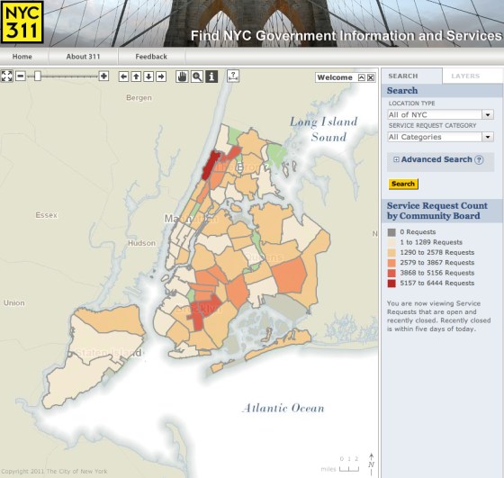
New York City launches 311 online service request map

If you read Steven B. Johnson, you know that 100 million 311 calls reveal a lot about New York. Now citizens can surf over to look at those 311 requests every day. Today, New York City launched a 311 online service request map.

“The launch of the 311 Service Request Map is another milestone in the City’s efforts to improve the way we report 311 data to the public,” said Deputy Mayor Stephen Goldsmith in a prepared statement. “The release of this information will better enable the public and elected officials to hold the City accountable for the services we provide. Putting better information into the hands of community leaders across the five boroughs increases transparency and allows us to collaboratively address the problems that neighborhoods face.”

It appears that Inwood and Washington Heights are making the most 311 service requests, according to the latest version of the map.

This 311 online service request map is a good start, with layers, custom searches and a clean design. Querying for those layers is a bit slow but returns relevant results for bike parking or continuing education, although many of the other layers appear to be grayed out and “coming soon.” Querying for specific request types was even slower, so for the moment I can’t find out where complaints about poison ivy, illegal animals or noisy church services are concentrated.

Early reviews have generally been positive but guarded, with room to grow. It’s a “huge step forward, long way to go,” tweeted Philip Ashlock. They “could get something better for free (eg mobile) by doing #Open311 API instead,” referring to the idea of government as a platform.

I “would much rather have the data raw via an API in an open [format] than the map UI (which isn’t all bad) in the way,” tweeted Mark Headd.

The “NYC 311 map is impressive technically, but lacks context (time period?), a legend (Maps 101), & metadata. I wonder if they talked to users before implementing it,” tweeted Steven Romalewski. “Also, the city obviously has the address-level 311 data. It’d be nice if they published the raw data so others could analyze it (residents & NYC Council reps have been asking for this for years). That would indicate a real commitment to transparency.”

UPDATE: Nick Judd published an excellent post on the New York City 311 map at techPresident, where he reports that “raw complaint data from 311 on the city’s data repository, the NYC DataMine, later this year, according to a city spokesman.” Judd also fills in a couple of key details, like:

  • The application was built using the city’s public city-wide geospatial information system, CityMap
  • Requests for literature are not included in the NYC 311 map
  • Deputy Mayor Stephen P. Goldsmith acknowledged in a press conference today, reported on by the New York Times, “this addition to the city’s open data efforts was a nod to transparency advocates.”

“Some of this will not be entirely exciting for those of us whose job it is to make sure that the holes in the street are filled and the trash is picked up because it’ll provide visibility to what we are or not doing,” Mr. Goldsmith said. “And some of you will enjoy that visibility.”

As Judd links out, in the New York Times Cityroom blog has good coverage of the step towards getting a visual on New Yorkers’ 311 calls.